Control Catalogue
Overview
Considering the different user roles, in the Control Catalogue you can find:
Table view of the controls you have access to and the essential information for each one.
Dashboard view of your controls for each facet that is available.
The different views available offer you different perspectives for further analysis of your controls.
You also have the option to export the controls that are visible to you in the Control Catalogue.
How the role of a user changes the controls I can see?
The Control Catalogue shows you controls based on your assigned role.
As a |
You can see controls |
|---|---|
|
|
|
|
How can I access the Control Catalogue?
Click on Control Catalogue inside the Side Navigation Bar.
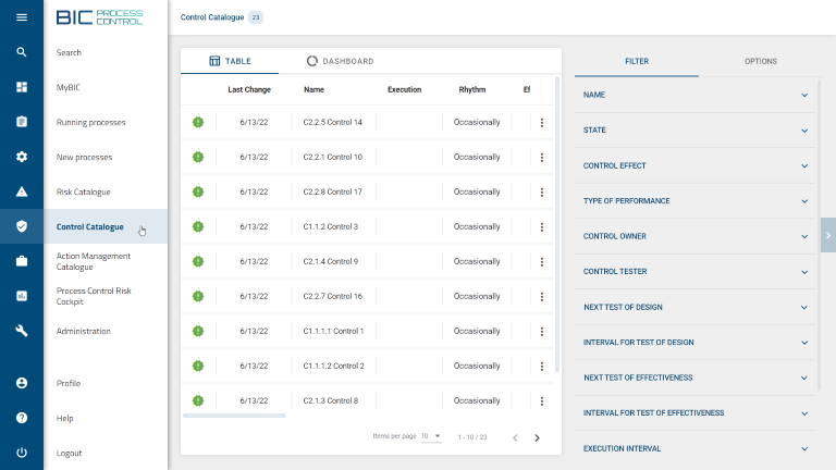
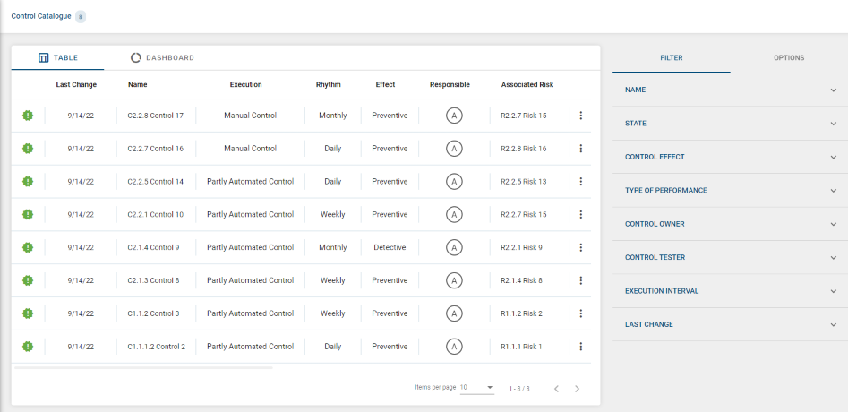
Table view
The Table shows you an overview of the recorded controls you have access to and the essential information for each one.
If a control is not approved yet, you will see a green exclamation mark  on the left side: this means Test of Design is still pending.
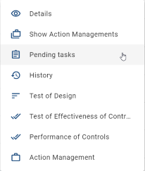
From the context menu of each control (three dots on the right side  ) you are able to:
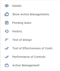
See the full control Details.
See the Action Managements of a given control.
See the Pending tasks of a given control.
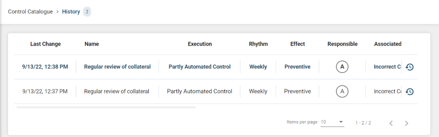
See previous information and reviews of a control in the History section, and trackback every entry in the history of the corresponding process.
Start the following processes Test of Design, Test of Effectiveness of Controls, Performance of Controls and Action Management for a control.
On the right side of the catalogue, there is a menu bar with an option that allows you to Export the complete Control Catalogue that is visible to you.
How can I distinguish if a control is active or obsolete?
You can easily do this by using the “STATE” option, available on top of the Filter menu (right side of the screen).
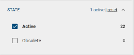
This option has two possible values that can be selected:
Active: By selecting this value, you will visualize only those controls which are currently active. Therefore you can start new processes related to these controls.
Active controls will be displayed with the
Obsolete: By selecting this value, you will visualize only those controls which have been rated as Obsolete. A control can be rated as obsolete during the Test of Design process or through the connector. In detail, when a diagram gets depublished, all controls of this diagram will be obsolete. The same goes for a control that is removed from a diagram.
Obsolete controls will be displayed with the
icon to their left and it is not possible to start new processes for them.
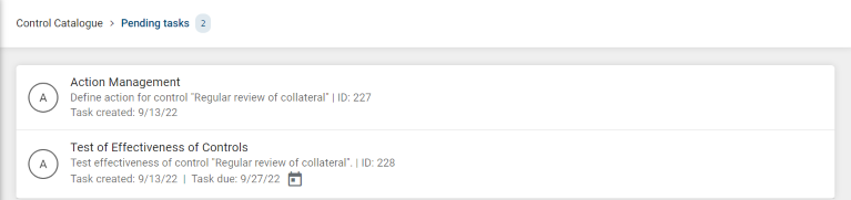
How can I access the pending tasks for a given control?
There are two ways to access the list of pending tasks for a given control:
Clicking on the numerical chips.
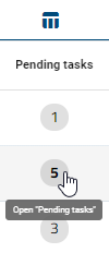
Using the context menu option Pending tasks.
As a result, you will see the list of pending tasks.
Note
Inside this section you must take into account the different user role restrictions, and also that Done tasks will not be shown as part of the list.
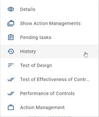
How can I access the History of a control?
You can access the History of a control inside the context menu button .
How can I export a control to a PDF file?
To export a control to a PDF file, follow these steps:
Open the details view of the control (by clicking on the entry or using the context menu).
On the right side of the details view, you will find a button
 . This button provides access to the Options side menu.
Click Export PDF
 to download the PDF file.
Once the download is complete, open the file to visualize its content.
The PDF includes all the information present in the details view. If a process was involved to create this version of the control, then the PDF file also contains the audit trail of that process.
Note
In order to create PDF files of historical versions, switch to the History view of the control. Then open the details of the desired version and follow Steps 2 to 4.
How can I sort entries in the Control Catalogue?
You have the option to sort catalogue entries by column headers. When holding the mouse pointer over a specific column header, if the column is sortable, a clickable icon with the shape of an arrow appears  .
.
By clicking on the arrow, the selected column is sorted. Depending on the data type, columns can be sorted alphabetically (A to Z) or by date (oldest/earliest dates).

The sorting order can be inverted by clicking again on the arrow.

The direction of the arrow points upwards or downwards in relation to the current sorting order. The last selected column is marked with a static arrow.
Dashboard view
The Dashboard view offers a chart for each facet that is available and shown as a multi-value selection facet.
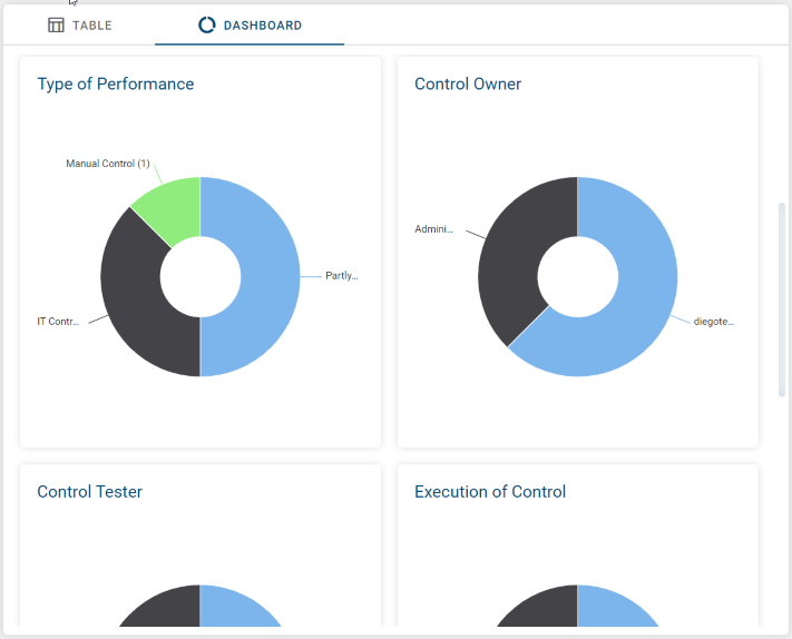
How are the charts sorted inside the Dashboard view?
The charts are sorted following the same order as the facets available in the Filter menu.
Based on which data the charts are calculated?
The data is based on the controls that you can see according to your role and on the active filter facets.
Filter
How can I filter catalogue entries?
If you enter the Control Catalogue view, you will find the Filter menu on the right side. The Filter shows you a list of facets based on your catalogue entries.
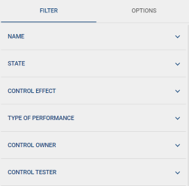
Facets can be expanded or collapsed by clicking on them. Among the different filtering options, you can find multi-value pickers and date pickers.
- Multi-selection pickers are shown in two different ways, depending on their number of facet values:
simple multi-selection facet
quick-filter multi-selection facet
If the facet contains more than 15 entries it will be rendered as quick-filter multi-selection facet.
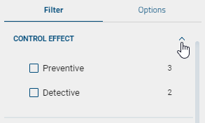
Simple multi-selection facet
When you open a simple multi-selection facet, you can see the total number of how many controls match each filter value.
Filter values are sorted in descending order from the highest number of matching hits to the lowest. If two or more filter values happen to have the same number of hits, then filters are alphabetically sorted in ascending order.
When you select a facet value, the shown number of matching hits for each facet value and the Control Catalogue view are updated accordingly.
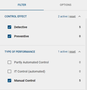
Multiple selections can be undone by clicking again on the selected facet values or by using the remove option.
Each facet header indicates the number of active facet values that are used to filter the Control Catalogue. For example,  for CONTROL EFFECT.
Quick-filter multi-selection facet
In difference to the simple multi-selection facet, the quick-filter variant is intended to manage a long list of facet values. In order to achieve that, the facet contains of two components:
An input field, that allows to quick-filter the list of facet values
A rectangle with a fixed height that contains a scrollable list of the facet values.
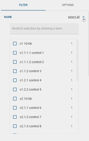
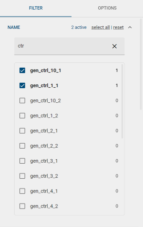
The basic behavior of the list of facet values is the same like for the simple representation. In addition the quick-filter variant offers a select all option, which will select all currently visible entries. For example now you can easily use an hierarchical prefix of your controls name in the Name facet, in order to quickfilter for a subset of the controls and easily select all of them in one click.
By selecting a value it is positioned at the top of the list and the number of hits displayed in the Control Catalogue view is updated accordingly.
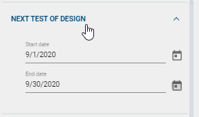
Date pickers. You have the option to filter by:
All values, that are after or equal to a given Start date
All values, that are before or equal to a given End date
All values, that are after or equal to a given Start date and before or equal to a given End date
Options
How can I export controls from the Control Catalogue?
On the right side of the catalogue there is the Options menu bar that offers an export option, creating a downloadable .XLSX file format.
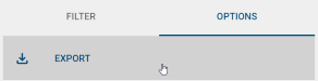
By clicking on EXPORT you download the complete Control Catalogue of all controls that are visible to you.